Getting these printed for the kids to hand out this Valentines Day. I took the pics in my living room, added some texture overlays and valentine overlays. Once printed we are adding a sucker in their hands. I will share pics of the completed ones later tonight when they get them done. I just couldn't wait to share the pics. LOL
Showing posts with label Photoshop. Show all posts
Tuesday, February 12, 2013
Sunday, July 22, 2012
Creating a Clipping Mask in Photoshop
Hey there! Been playing some more in Photoshop and today I wanted to share how to make a cool "clipping mask" photo. If you follow my pics on Instagram, you probably already saw this picture. But today I created a tutorial for it. I may have used a different font in the one you saw.
Anyway...I am excited to share it with you and hope that I can explain it well enough that you understand. And I have to mention, there are probably other ways to do this, this is just what makes sense to me. Hope it works for you too! I tried to make it as simple as possible. Here goes....
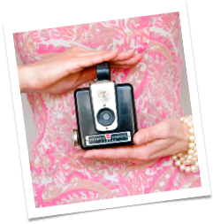
My before picture is already edited in Photoshop. I adjusted the brightness and contrast, added 4 different textures and used the brush tool to remove the texture from their faces. You can visit HERE to see my texture tutorial.
Because I added layers with the textures, the first step is to merge all the layers into one. Highlight all 5 layers, right click and select merge layers. You will now have one photo layer.
Next you want to add your text. In the tools, right click on your text tool and select Horizontal Type tool.
Type in what ever you like. I chose the word LOVE! Make sure you pick a bolder font and adjust the size. The bigger and bolder, the more parts of the photo will show through.
Use your move tool to place it where you want it on your photo. I liked the bottom left.
Now open up a new layer. It will be transparent to use your paint bucket tool to color it in white.
Time to rearrange the layers. You want the photo layer on top, then below that the text layer and lastly the new all white layer on the bottom. Below is how it should look.
Before we create the clipping mask, you will want to duplicate your photo layer and drag it to the bottom of all the layers.
Your layers will now look like this below.
Go back up to the top photo. Click on it so it is highlighted. Right click and scroll down to Create a Clipping mask. This is the fun part. ;) The magic happens when you click it. LOL
SURPRISE! Your first Clipping mask. Ta Da!!!
Doesn't that look so cool. You can see your picture through the words.
You can crop and save many words with this process and use them as layers on other photos. Very cool!
You ready to make it even more exciting? Scroll below and read on.
Leaving the clipping mask like this on a scenery pic is fun, but with a pic like this, its fun to add the photo back in behind the mask.
Do this by highlighting on the white layer, right click and select blending options. In general blending, change the blend mode to lighten and the opacity to 50% or to whatever % you think looks best for your photo. Click on Ok and you are done!
Here is my completed pic from this tutorial. What do you think?
I love that the photo is faded in the back and the letters have the original color. Plus it is made from the same photo, so nothing is covered up in the photo. You get a nice clean look!
Here are a few more pics I made with this same process.
Ok, I'm off to edit more photos. Hope you like this post! If so, please let me know in the comments below!
Thursday, July 12, 2012
Creating an Overlay in Photoshop
So today I want to share with you some Photoshop Fun! OVERLAYS!
Last night I was playing with some of my family photos from last november. You can see more of them HERE. And I have to admit that although I do have the most amazing Photoshop program ever, I do not know how to use all of its powers. LOL So I started playing with some textures and finally figured out how to make an overlay. I am pretty proud of myself. (pat on the back, heehee)
I first searched google for how to turn an image into an overlay and got frustrated because either the tutorials I found were either confusing or vague. Uuuugghhh. And I am sure they are great for others, just not for me. So I just went into Photoshop and started exploring. It didn't take long. I was determined.
Here is what I did! First I opened my family image in one window.
This is my before image.
Next I opened up my texture in another window.
This is my texture image.
You now should have two windows open. One is your photo and the other is your texture. While in the texture window, Click on the background image in your layers window and drag it to your Photo.
You will now have created a new layer in your photo window.
You will see your photo with the new texture layer on top of the photo.
Now right click your new texture layer. Click on Blending Options.
A new window will open called Layer Style. In the general blending box you want to click on the area that shows "normal". A drop down menu will appear and you want to go down the list and find "overlay". Click on that.
After doing this you will see the texture image change to an overlay image. Then all you have to do is play with the Opacity percentages to the right look for you.
Here is what I did with my Opacity percentages.
I set my Opacity to 65% in the advanced bleeding settings. You can also use the general bleeding Opacity settings if you like.
Click ok to close the layer style box. Resize your texture overlay to fit the whole photo, save and print your new photo for your wall gallery.
Look at the differences
Again here is the photo "before" I added the overlay.
And here is the photo "after" I added the overlay.
Can you see the differences? It's brighter, has torn edges on the sides and some subtle crinkles in the photo. I love it!
Hope you like my lil tutorial today. Was it easy enough or did I confuse you? Any questions, you can leave them in comments below or email me at trendytreehouse@me.com.
More fun Textures can be found at Life N Reflection. I bought some and played with them this morning using her tutorial from last weeks Create and Share link up.
Here is the same family photo using her textures and tutorial.
Her tutorial is great and explains what textures and Opacity she used for each texture.
I can share more blending options in future tutorials if you like too but today I just shared a quick Overlay option with 1 texture. The below pic has 3 textures and 3 blending options. See below for more.
I used the Life N Reflection Tutorial as an example and the Blending Options Opacity was ~ (legacy b texture) Overlay at 50%, (legacy d texture) Linear Burn at 100% and (legacy a texture) Dark Color at 55%.
Get the Legacy Textures HERE and search her goodies HERE.
BTW...have you wondered how to make a screenshot on your mac? It is so easy. Just hit "Command, Shift, 3" Your image will automatically save as a PNG file. Go to you Finder and search for screenshots. That's it. It's that easy. ;)
Get the Legacy Textures HERE and search her goodies HERE.
BTW...have you wondered how to make a screenshot on your mac? It is so easy. Just hit "Command, Shift, 3" Your image will automatically save as a PNG file. Go to you Finder and search for screenshots. That's it. It's that easy. ;)
Friday, March 2, 2012
Pinterest Challenge - You is...

Every Friday...stop by for the "Pinterest Party Challenge"
You can link up posts related to a Pinterest inspired tutorial, recipes, projects, ect. Basically something you love, found on Pinterest that you want to make.
- Follow Trendy Treehouse via Google Friend Connect
- Link up only posts related to this challenge. Not your home page
- VERY IMPORTANT...Include a link to the original PIN. (where you got your inspiration) They deserve credit for their hard work too!
- Please DO NOT link up none Pinterest related posts, shops or giveaways.
- Share the i took the {PINTEREST} challenge button somewhere on your blog or in your post.
- Visit at least 3 other link ups and leave meaningful comments.
- Come back next week to see if your link has been featured and to share another fun Pin Inspired Project
YOU IS...Prints
See these larger below the linky party
PLEASE READ...I am getting a few more link ups that don't apply and don't always have time to get them off right away. Please remember to only link up posts that relate to this part. You can link up all others to our Create and Share party on Wednesdays. Thanks!


I plan on printing these out, matting and framing them for the kids rooms. They are going to look so cute and fit right in with the colors of their room!


I'll share photos of their rooms soon. We are painting and redecorating. They were very excited to go to the paint store and pick out colors. So room updates coming soon....
Friday, February 24, 2012
Pinterest Challenge - Family Dates Print

Every Friday...stop by for the "Pinterest Party Challenge"
You can link up posts related to a Pinterest inspired tutorial, recipes, projects, ect. Basically something you love, found on Pinterest that you want to make.
- Follow Trendy Treehouse via Google Friend Connect
- Link up only posts related to this challenge. Not your home page
- VERY IMPORTANT...Include a link to the original PIN. (where you got your inspiration) They deserve credit for their hard work too!
- Please DO NOT link up none Pinterest related posts, shops or giveaways.
- Share the i took the {PINTEREST} challenge button somewhere on your blog or in your post.
- Visit at least 3 other link ups and leave meaningful comments.
- Come back next week to see if your link has been featured and to share another fun Pin Inspired Project
Check out my larger print below the Linky Party
I'm sharing Family Dates Print. Inspired by one found on Etsy through Pinterest. Visit The Memory Gallery to order one for yourself. She has a great variety of fun prints to choose from.
PLEASE READ...I am getting a few more link ups that don't apply and don't always have time to get them off right away. Please remember to only link up posts that relate to this part. You can link up all others to our Create and Share party on Wednesdays. Thanks!
Anyway...here is my print.

Sunday, June 13, 2010
♥ Guest Blogger ♥


~ She is posting a fantastic tutorial on how to make your photo POP. Sorry little pun there. There is a bubble in the photo. LOL On to Rebekah's great post~
I am more than happy to be a guest blogger at Trendy Treehouse! I just love Tara for allowing my weirdness on her site. I’m Rebekah from www.potholesandpantyhose.com and I blog about my life on the road with my musician hubby, my remodeling projects, my photography, and the arts and crap that I enjoy making from cast-offs. I try to maintain a somewhat normal life, however, normalcy keeps escaping me.
Let me give you a disclaimer on this tutorial-I am not a professional photographer. I just
enjoy sharing the knowledge that I do have with people that might appreciate a tip here or there.
Today, I would like to show you how to take and edit an unconventional photo.
Let’s get started! Making your subject at ease can be tough. I like to put the client in a familiar setting or position to help them relax. My subject was most at ease doing this-blowing a bubble.
Isn’t he just the cutest?
I liked the photo, but there were a few things that needed a fixin’. (That’s Okie talk...)
I didn’t like the chair sticking into the frame. I made a copy of the background and then cropped out the offender.
His skin looked a little flat, so I used the ‘diffuse glow’ function. It’s very flattering to skin tones-boys and girls alike.
He looks so darn purty now. But don’t tell him. He is very macho.
The overall color was too brown for me. I adjusted the levels using ‘color balance’ (found under the tab ‘Image’ and scrolling down to ‘adjustments’).
His eyes needed to pop a little more, so I lassoed both of those cute little suckers and clicked on the ‘Filter’ tab. Scroll down to ‘Sharpen’ and then choose ‘unsharp mask’ and adjust the amount, the radius and the threshold to your liking.
I learned this from Pioneer Woman. I like her. And her photo tricks.
Next, I wanted the bubble gum to stand out a bit more. I lassoed it and then clicked on the ‘Image’ tab and scrolled down to ‘Hue and Saturation’. I brought out the pink in the gum a little more.
Here is the cute finished product. I just love this little guy. However, he is my nephew after all, and I am a little biased.
Come on by www.potholesandpanythose.com to see other basic tutorials on photography, arts and crap, remodeling or many other weirdo things that I am into. I would love to hear from you!
Thanks again Tara for letting me guest blog today!
-Rebekah
Subscribe to:
Posts (Atom)